matplotlib
测试用数据:
unrate.csv:https://pan.baidu.com/s/1uVCVvYKfcphjqcbMpLBdkg
fandango_scores.csv:https://pan.baidu.com/s/1jareiLJC0YzNKgTOUxdbqQ
percent-bachelors-degrees-women-usa.csv:https://pan.baidu.com/s/1oPtYASsjEoZbD8PEwNWFrw
train.csv:https://pan.baidu.com/s/1Y2NaPDYtRxFWJABd1YxxJg
import pandas as pd |
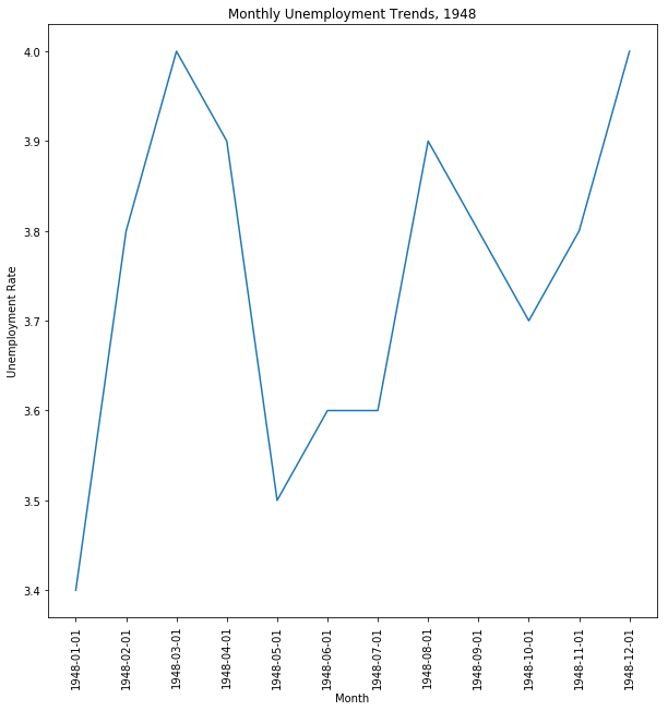
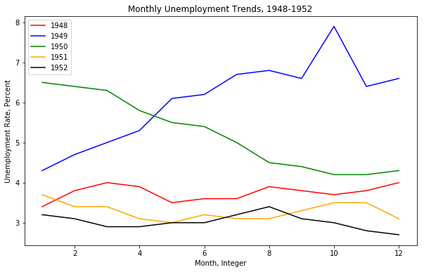
          DATE  VALUE
0   1948-01-01    3.4
1   1948-02-01    3.8
2   1948-03-01    4.0
3   1948-04-01    3.9
4   1948-05-01    3.5
5   1948-06-01    3.6
6   1948-07-01    3.6
7   1948-08-01    3.9
8   1948-09-01    3.8
9   1948-10-01    3.7
10  1948-11-01    3.8
11  1948-12-01    4.0
import matplotlib.pyplot as plt |
first_twelve = unrate[0:12] |
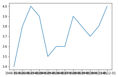
plt.plot(first_twelve['DATE'], first_twelve['VALUE']) |
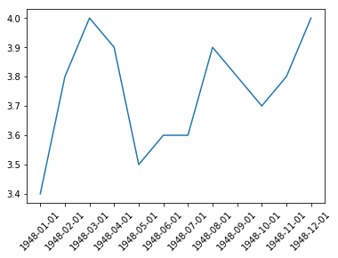
plt.figure(figsize=(10, 10)) |
import matplotlib.pyplot as plt |
import numpy as np |
print(unrate['DATE']) |
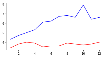
fig = plt.figure(figsize=(10,6)) |
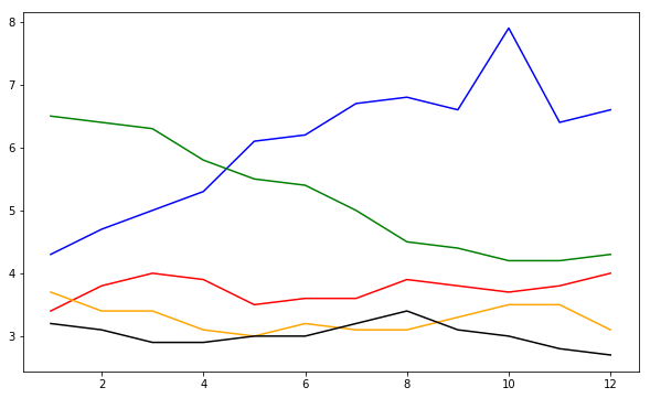
fig = plt.figure(figsize=(10,6)) |
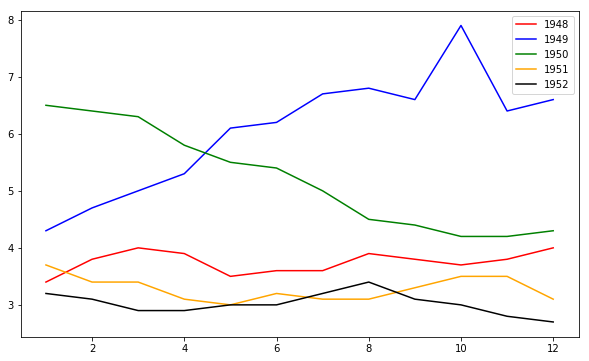
fig = plt.figure(figsize=(10,6)) |
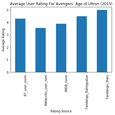
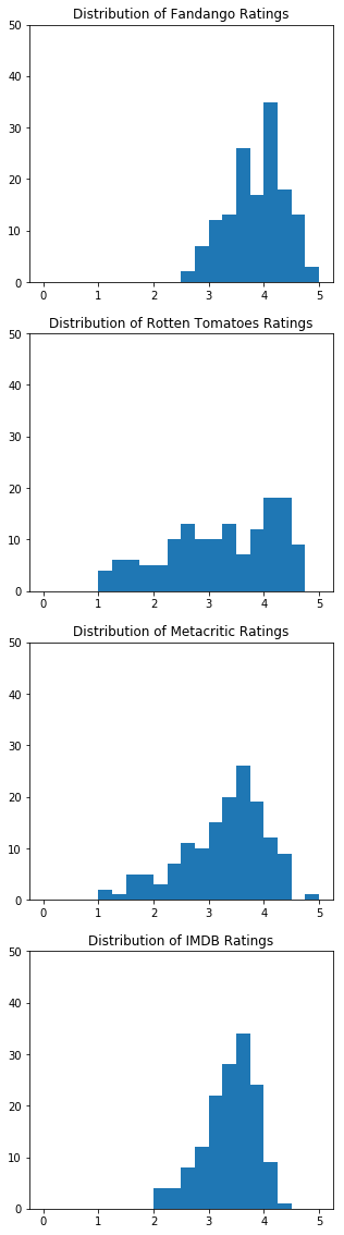
import pandas as pd |
                             FILM  RT_user_norm  Metacritic_user_nom  \
0  Avengers: Age of Ultron (2015)           4.3                 3.55

   IMDB_norm  Fandango_Ratingvalue  Fandango_Stars
0        3.9                   4.5             5.0
import matplotlib.pyplot as plt |
num_cols = ['RT_user_norm', 'Metacritic_user_nom', 'IMDB_norm', 'Fandango_Ratingvalue', 'Fandango_Stars'] |
import matplotlib.pyplot as plt |
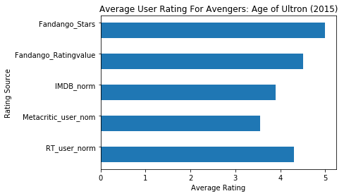
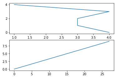
fig, ax = plt.subplots() |
#Switching Axes |
fig, ax = plt.subplots() |
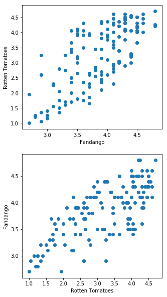
fig = plt.figure(figsize=(5,20)) |
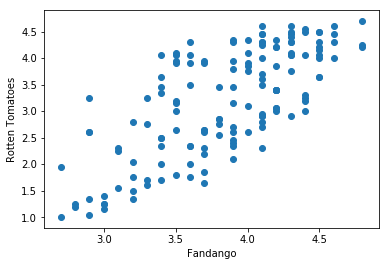
fig, ax = plt.subplots() |
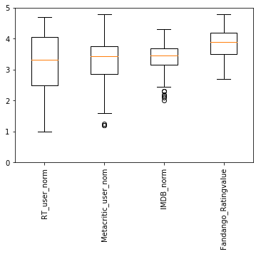
num_cols = ['RT_user_norm', 'Metacritic_user_nom', 'IMDB_norm', 'Fandango_Ratingvalue'] |
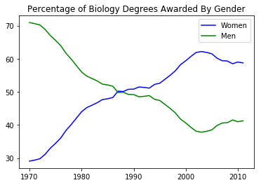
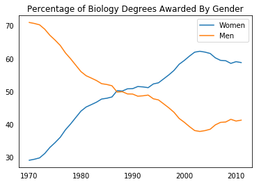
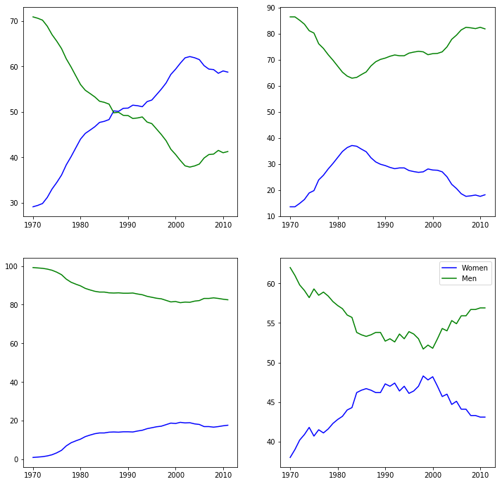
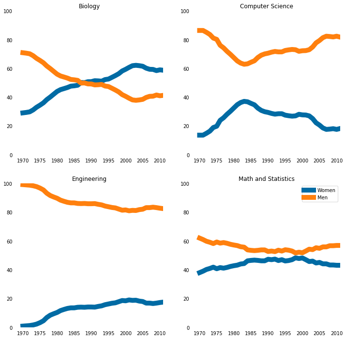
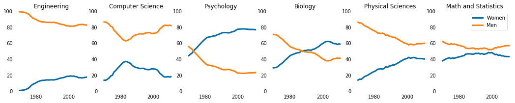
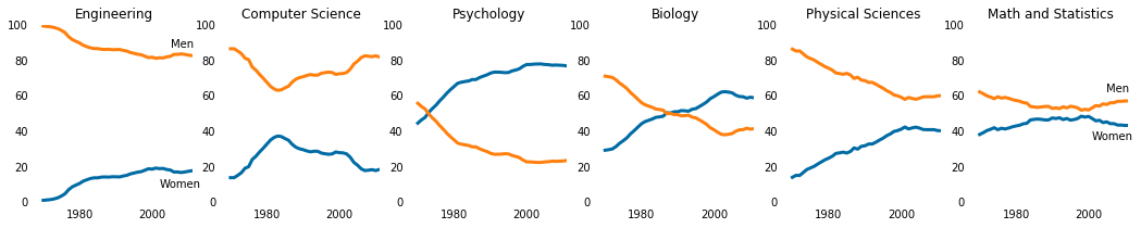
women_degrees = pd.read_csv('percent-bachelors-degrees-women-usa.csv') |
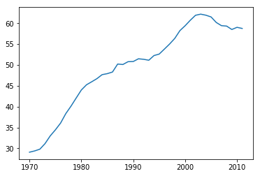
plt.plot(women_degrees['Year'], women_degrees['Biology'], c='blue', label='Women') |
fig, ax = plt.subplots() |

fig, ax = plt.subplots() |
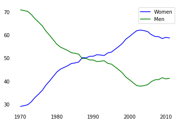
major_cats = ['Biology', 'Computer Science', 'Engineering', 'Math and Statistics'] |
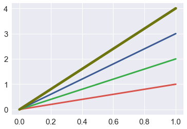
#Color |
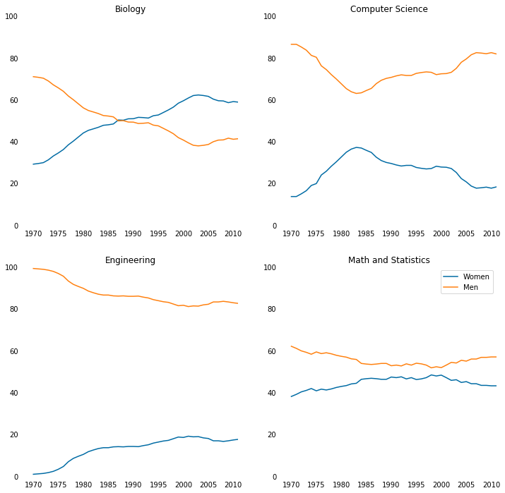
#Setting Line Width |
stem_cats = ['Engineering', 'Computer Science', 'Psychology', 'Biology', 'Physical Sciences', 'Math and Statistics'] |

fig = plt.figure(figsize=(18, 3)) |
seaborn
import pandas as pd |
import seaborn as sns |
import seaborn as sns |
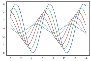
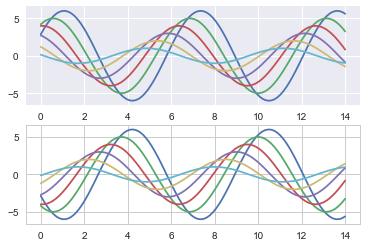
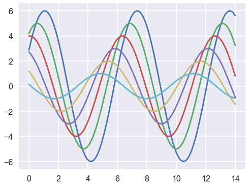
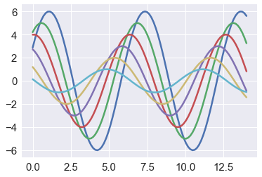
def sinplot(flip=1): |
sinplot() |
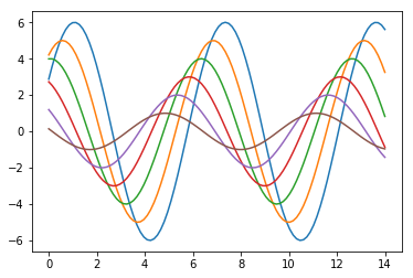
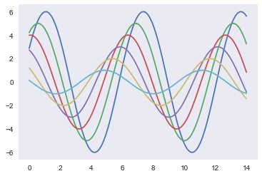
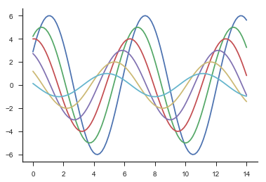
sns.set() |

5种主题风格
- darkgrid
- whitegrid
- dark
- white
- ticks
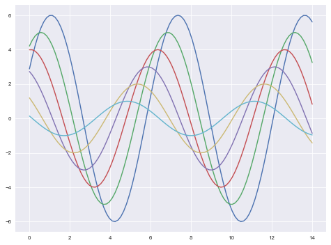
sns.set_style("whitegrid") |

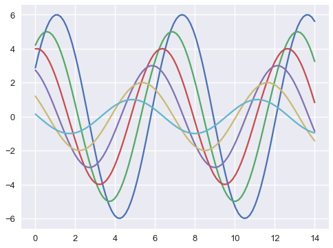
sns.set_style("dark") |
sns.set_style("white") |
sns.set_style("ticks") |
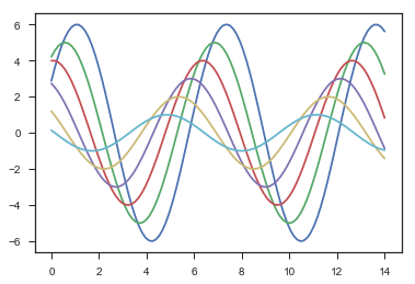
sinplot() |
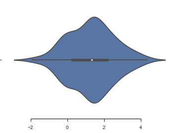
sns.violinplot(data) |
sns.set_style("whitegrid") |
with sns.axes_style("darkgrid"): |
sns.set() |
sns.set_context("talk") |
sns.set_context("poster") |
sns.set_context("notebook", font_scale=1.5, rc={"lines.linewidth": 2.5}) |
调色板
- 颜色很重要
- color_palette()能传入任何Matplotlib所支持的颜色
- color_palette()不写参数则默认颜色
- set_palette()设置所有图的颜色
分类色板
current_palette = sns.color_palette() |

圆形画板
当你有六个以上的分类要区分时,最简单的方法就是在一个圆形的颜色空间中画出均匀间隔的颜色(这样的色调会保持亮度和饱和度不变)。这是大多数的当他们需要使用比当前默认颜色循环中设置的颜色更多时的默认方案。
最常用的方法是使用hls的颜色空间,这是RGB值的一个简单转换。
sns.palplot(sns.color_palette("hls", 8)) |

data = np.random.normal(size=(20, 8)) + np.arange(8) / 2 |
hls_palette()函数来控制颜色的亮度和饱和
- l-亮度 lightness
- s-饱和 saturation
sns.palplot(sns.hls_palette(8, l=.7, s=.9)) |

sns.palplot(sns.color_palette("Paired",8)) |

使用xkcd颜色来命名颜色
xkcd包含了一套众包努力的针对随机RGB色的命名。产生了954个可以随时通过xdcd_rgb字典中调用的命名颜色。
plt.plot([0, 1], [0, 1], sns.xkcd_rgb["pale red"], lw=3) #https://xkcd.com/color/rgb/ |
colors = ["windows blue", "amber", "greyish", "faded green", "dusty purple"] |

连续色板
色彩随数据变换,比如数据越来越重要则颜色越来越深
Accent, Accent_r, Blues, Blues_r, BrBG, BrBG_r, BuGn, BuGn_r, BuPu, BuPu_r, CMRmap, CMRmap_r, Dark2, Dark2_r, GnBu, GnBu_r, Greens, Greens_r, Greys, Greys_r, OrRd, OrRd_r, Oranges, Oranges_r, PRGn, PRGn_r, Paired, Paired_r, Pastel1, Pastel1_r, Pastel2, Pastel2_r, PiYG, PiYG_r, PuBu, PuBuGn, PuBuGn_r, PuBu_r, PuOr, PuOr_r, PuRd, PuRd_r, Purples, Purples_r, RdBu, RdBu_r, RdGy, RdGy_r, RdPu, RdPu_r, RdYlBu, RdYlBu_r, RdYlGn, RdYlGn_r, Reds, Reds_r, Set1, Set1_r, Set2, Set2_r, Set3, Set3_r, Spectral, Spectral_r, Vega10, Vega10_r, Vega20, Vega20_r, Vega20b, Vega20b_r, Vega20c, Vega20c_r, Wistia, Wistia_r, YlGn, YlGnBu, YlGnBu_r, YlGn_r, YlOrBr, YlOrBr_r, YlOrRd, YlOrRd_r, afmhot, afmhot_r, autumn, autumn_r, binary, binary_r, bone, bone_r, brg, brg_r, bwr, bwr_r, cool, cool_r, coolwarm, coolwarm_r, copper, copper_r, cubehelix, cubehelix_r, flag, flag_r, gist_earth, gist_earth_r, gist_gray, gist_gray_r, gist_heat, gist_heat_r, gist_ncar, gist_ncar_r, gist_rainbow, gist_rainbow_r, gist_stern, gist_stern_r, gist_yarg, gist_yarg_r, gnuplot, gnuplot2, gnuplot2_r, gnuplot_r, gray, gray_r, hot, hot_r, hsv, hsv_r, icefire, icefire_r, inferno, inferno_r, jet, jet_r, magma, magma_r, mako, mako_r, nipy_spectral, nipy_spectral_r, ocean, ocean_r, pink, pink_r, plasma, plasma_r, prism, prism_r, rainbow, rainbow_r, rocket, rocket_r, seismic, seismic_r, spectral, spectral_r, spring, spring_r, summer, summer_r, tab10, tab10_r, tab20, tab20_r, tab20b, tab20b_r, tab20c, tab20c_r, terrain, terrain_r, viridis, viridis_r, vlag, vlag_r, winter, winter_r
sns.palplot(sns.color_palette("Blues")) |


如果想要翻转渐变,可以在面板名称中添加一个_r后缀
cubehelix_palette()调色板
色调线性变换
sns.palplot(sns.color_palette("cubehelix", 8)) |

sns.palplot(sns.cubehelix_palette(8, start=.5, rot=-.75)) |

sns.palplot(sns.cubehelix_palette(8, start=.75, rot=-.150)) |

light_palette() 和dark_palette()调用定制连续调色板
sns.palplot(sns.light_palette("green")) |

sns.palplot(sns.dark_palette("purple")) |

sns.palplot(sns.light_palette("navy", reverse=True)) |

sns.palplot(sns.light_palette((210, 90, 60), input="husl")) |

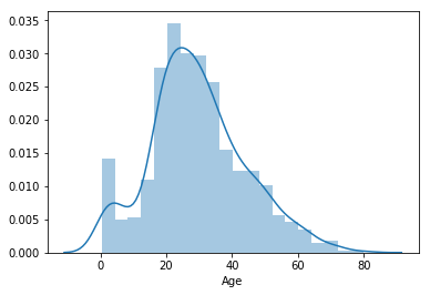
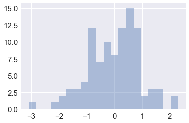
x = np.random.normal(size=100) |
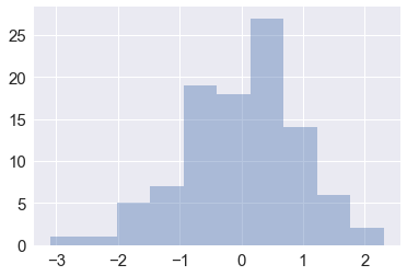
sns.distplot(x, bins=20, kde=False) |
from scipy import stats, integrate |

mean, cov = [0, 1], [(1, .5), (.5, 1)] |
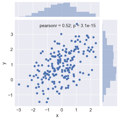
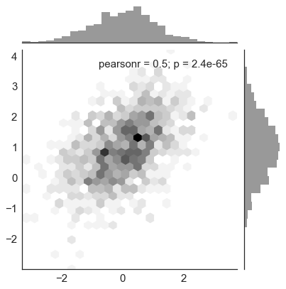
散点图
sns.jointplot(x="x", y="y", data=df) |
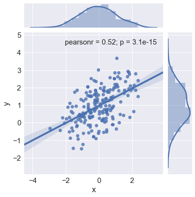
sns.jointplot(x="x", y="y", data=df,kind = "reg") |
x, y = np.random.multivariate_normal(mean, cov, 1000).T |
iris = sns.load_dataset("iris") |

tips = sns.load_dataset("tips") |
regplot()和lmplot()都可以绘制回归关系,推荐regplot()
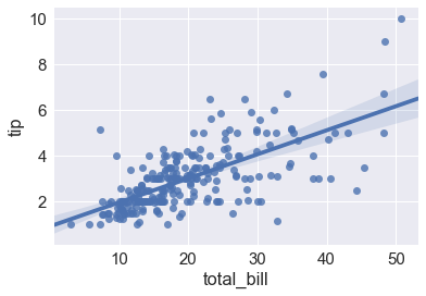
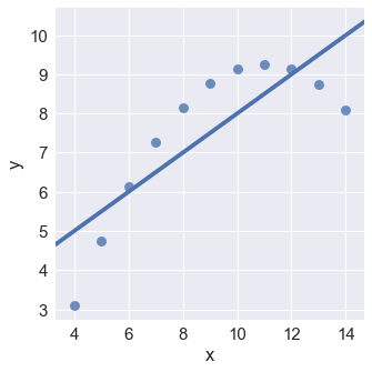
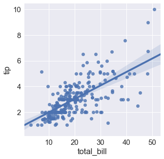
sns.lmplot(x="total_bill", y="tip", data=tips); |
anscombe = sns.load_dataset("anscombe") |
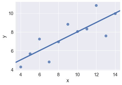
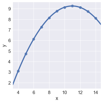
sns.lmplot(x="x", y="y", data=anscombe.query("dataset == 'II'"), |
sns.lmplot(x="x", y="y", data=anscombe.query("dataset == 'II'"), |
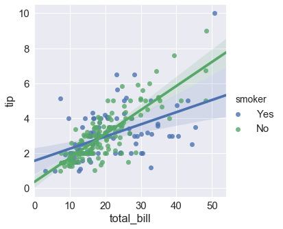
sns.lmplot(x="total_bill", y="tip", hue="smoker", data=tips); |
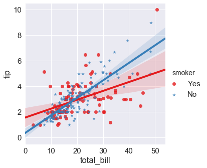
sns.lmplot(x="total_bill", y="tip", hue="smoker", data=tips, |
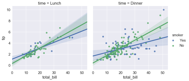
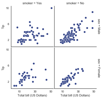
sns.lmplot(x="total_bill", y="tip", hue="smoker", col="time", data=tips); |
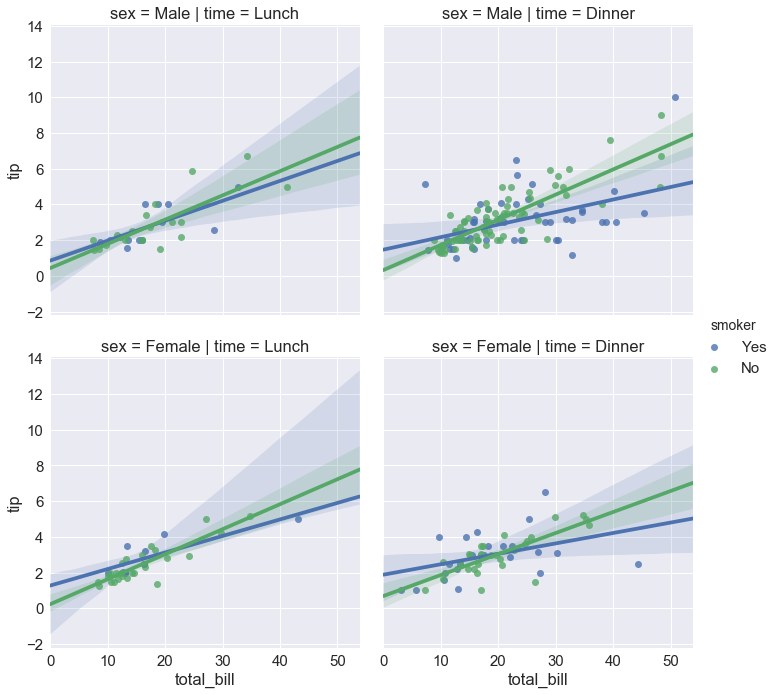
sns.lmplot(x="total_bill", y="tip", hue="smoker", |
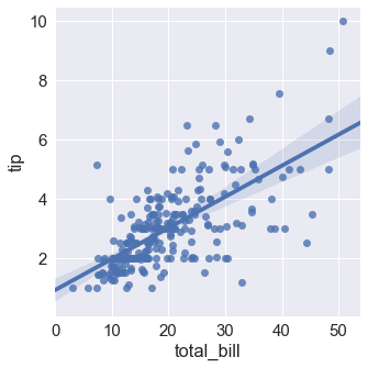
f, ax = plt.subplots(figsize=(5, 5)) |
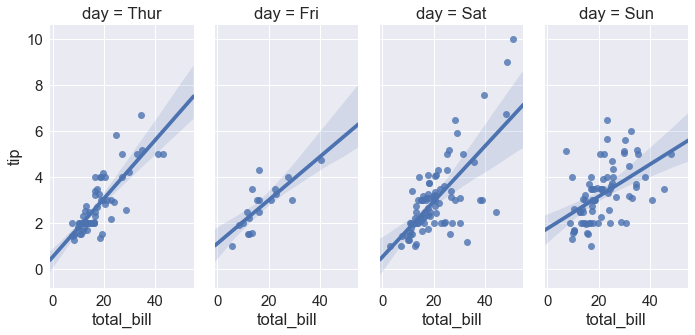
sns.lmplot(x="total_bill", y="tip", col="day", data=tips, |
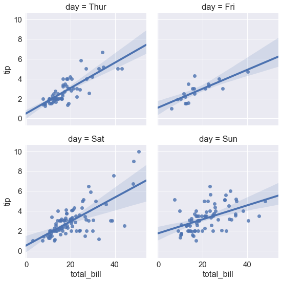
sns.lmplot(x="total_bill", y="tip", col="day", data=tips,) |
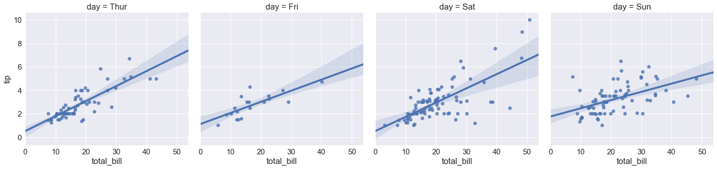
sns.lmplot(x="total_bill", y="tip", col="day", data=tips,aspect=.5) # aspect 长宽比 |
多变量
sns.set(style="whitegrid", color_codes=True) |
重叠是很常见的现象,但是重叠影响我观察数据的量了
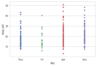
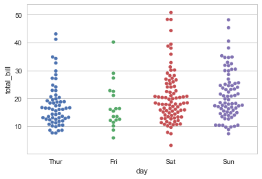
sns.stripplot(x="day", y="total_bill", data=tips, jitter=True) #抖动量 |
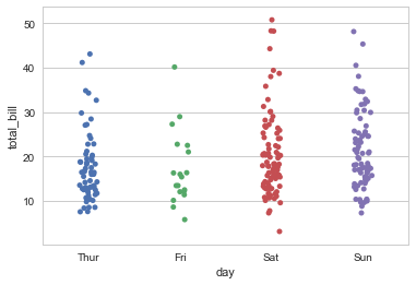
sns.swarmplot(x="day", y="total_bill", data=tips) |
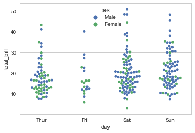
sns.swarmplot(x="day", y="total_bill", hue="sex",data=tips) |
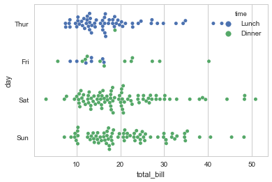
sns.swarmplot(x="total_bill", y="day", hue="time", data=tips) |
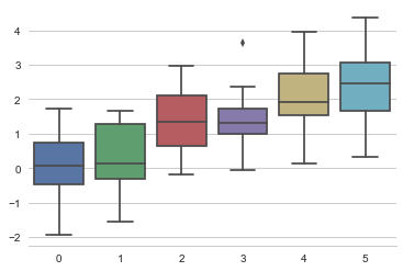
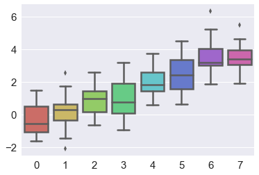
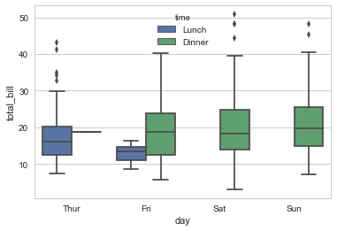
盒图
- IQR即统计学概念四分位距,第1/4分位与第3/4分位之间的距离
- $N = 1.5IQR$ 如果一个值$>Q3+N$或$<Q1-N$,则为离群点
sns.boxplot(x="day", y="total_bill", hue="time", data=tips) |
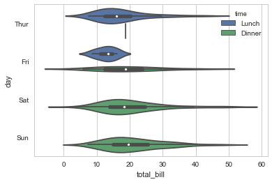
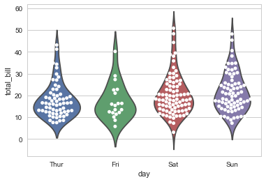
sns.violinplot(x="total_bill", y="day", hue="time", data=tips) |
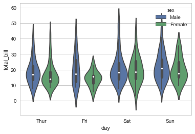
sns.violinplot(x="day", y="total_bill", hue="sex", data=tips, split=True) |
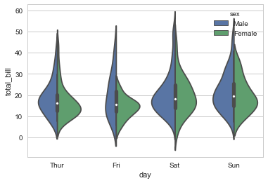
sns.violinplot(x="day", y="total_bill", hue="sex", data=tips) |
sns.violinplot(x="day", y="total_bill", data=tips, inner=None) #inner 小提琴内部图形 |
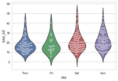
sns.violinplot(x="day", y="total_bill", data=tips, inner=None) |
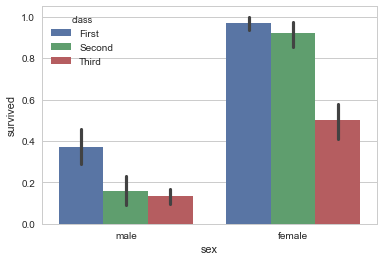
条形图
显示值的集中趋势可以用条形图
titanic = sns.load_dataset("titanic") |
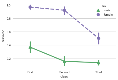
点图
点图可以更好的描述变化差异
sns.pointplot(x="sex", y="survived", hue="class", data=titanic); |

sns.pointplot(x="class", y="survived", hue="sex", data=titanic, |
宽形数据
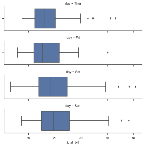
sns.boxplot(data=iris,orient="h") #orient 垂直和水平 |

多层面板分类图
sns.factorplot(x="day", y="total_bill", hue="smoker", data=tips) |
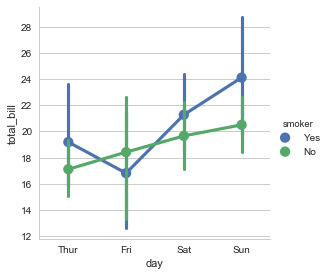
sns.factorplot(x="day", y="total_bill", hue="smoker", data=tips, kind="bar") |
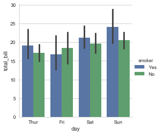
sns.factorplot(x="day", y="total_bill", hue="smoker", |

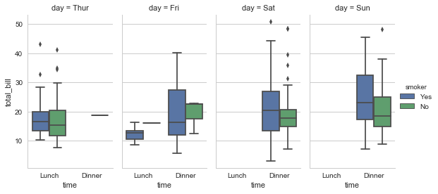
sns.factorplot(x="time", y="total_bill", hue="smoker", |
seaborn.factorplot(x=None, y=None, hue=None, data=None, row=None, col=None, col_wrap=None, estimator=, ci=95, n_boot=1000, units=None, order=None, hue_order=None, row_order=None, col_order=None, kind=’point’, size=4, aspect=1, orient=None, color=None, palette=None, legend=True, legend_out=True, sharex=True, sharey=True, margin_titles=False, facet_kws=None, **kwargs)
Parameters:
- x,y,hue 数据集变量 变量名
- date 数据集 数据集名
- row,col 更多分类变量进行平铺显示 变量名
- col_wrap 每行的最高平铺数 整数
- estimator 在每个分类中进行矢量到标量的映射 矢量
- ci 置信区间 浮点数或None
- n_boot 计算置信区间时使用的引导迭代次数 整数
- units 采样单元的标识符,用于执行多级引导和重复测量设计 数据变量或向量数据
- order, hue_order 对应排序列表 字符串列表
- row_order, col_order 对应排序列表 字符串列表
- kind : 可选:point 默认, bar 柱形图, count 频次, box 箱体, violin 提琴, strip 散点,swarm 分散点 size 每个面的高度(英寸) 标量 aspect 纵横比 标量 orient 方向 “v”/“h” color 颜色 matplotlib颜色 palette 调色板 seaborn颜色色板或字典 legend hue的信息面板 True/False legend_out 是否扩展图形,并将信息框绘制在中心右边 True/False share{x,y} 共享轴线 True/False
g = sns.FacetGrid(tips, col="time") |
sns.set(style="ticks") |
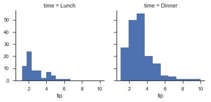
g = sns.FacetGrid(tips, col="time") #占位 |
g = sns.FacetGrid(tips, col="sex", hue="smoker") |

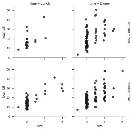
g = sns.FacetGrid(tips, row="smoker", col="time", margin_titles=True) #变量标题右侧,实验性并不总是有效 |
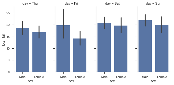
g = sns.FacetGrid(tips, col="day", size=4, aspect=.5) |
from pandas import Categorical |
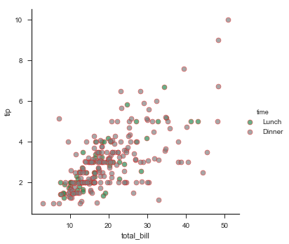
pal = dict(Lunch="seagreen", Dinner="gray") |
g = sns.FacetGrid(tips, hue="sex", palette="Set1", size=5, hue_kws={"marker": ["^", "v"]}) |

with sns.axes_style("white"): |
iris = sns.load_dataset("iris") |
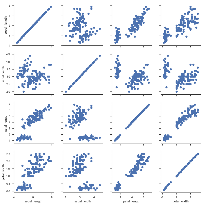
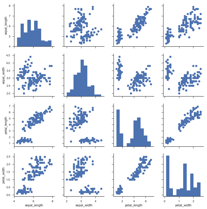
g = sns.PairGrid(iris) |
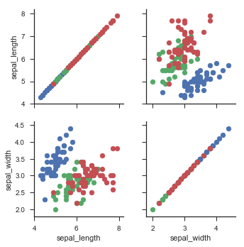
g = sns.PairGrid(iris, hue="species") |

g = sns.PairGrid(iris, vars=["sepal_length", "sepal_width"], hue="species") #vars 取一部分 |
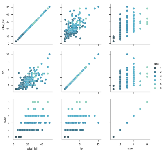
g = sns.PairGrid(tips, hue="size", palette="GnBu_d") |
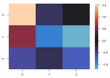
热力图
uniform_data = np.random.rand(3, 3) |
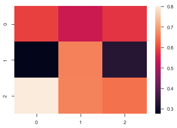
ax = sns.heatmap(uniform_data, vmin=0.2, vmax=0.5) #最大最小取值 |
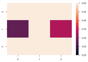
normal_data = np.random.randn(3, 3) |
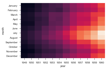
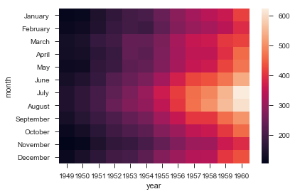
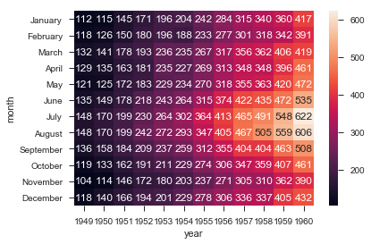
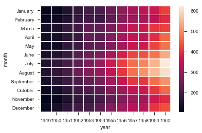
flights = sns.load_dataset("flights") |
ax = sns.heatmap(flights, annot=True,fmt="d") |
ax = sns.heatmap(flights, linewidths=.5) |
ax = sns.heatmap(flights, cmap="YlGnBu") |
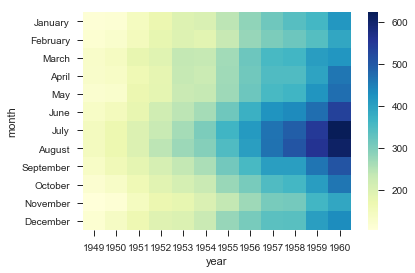
ax = sns.heatmap(flights, cbar=False) #隐藏bar |